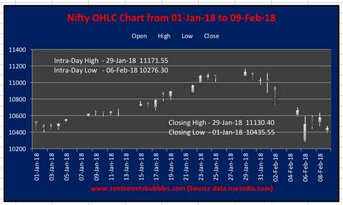
The Nifty OHLC (Open, High, Low, Close) chart for the current calendar year is shown above. The intra-day and closing basis high / low has also been highlighted. Year-to-Date (YTD) and on a closing basis, the Nifty 50 is up by just 0.19 percent. In other words, we are back where we began the year.
On any trading day, what matters is the close. The closing price of the Nifty 50 on any trading day is the ‘verdict’, as the TA (Technical Analysis) guys would call it and rightly so. Hence, looking at intra-day highs and lows is pointless. Even if one were to look at the intra-day highs and lows, the benchmark has fallen 8.01 percent. When markets fall ten percent or more from the top, it is referred to as a correction. Officially, we aren’t even in correction territory as yet. That is how extended the up move has been!
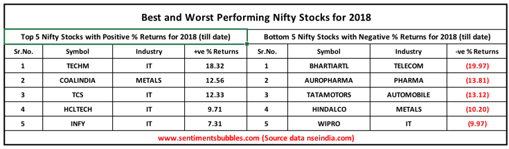
However, the stocks that comprise the Nifty 50 have got mauled. Of the fifty stocks, seventeen shares are in the green and thirty-three are in negative territory (YTD). The five best performing and worst performing stocks in the Nifty 50 for the current calendar year are shown below:
Point Falls Analysis
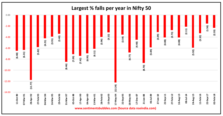
The image below shows the Largest Yearly Point Falls on a historical basis, in percentage terms. As is clear from the picture, the calendar year 2017 was an exceptionally abnormal year. We had a pullback that was below two percent, that is incredible and unprecedented.
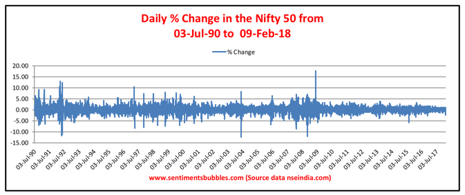
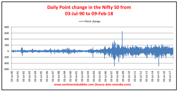
The image below looks at the daily percentage changes (on a closing basis) for the Nifty 50 from 03 July 1990 till date. In percentage terms and as compared to similar historical instances, the recent downward move is no big deal.
The data for the same period shown in terms of the number of points looks like this.
From a historical perspective (on a closing basis) the largest pullback/s in the Nifty 50 in points is shown below. The highest fall in terms of the number of points is shown at the extreme left and then in descending order. The recent tumble figures as the ninth largest. If you look closely, of the other nine falls, five were in the calendar year 2008, two in 2015, one each in the years 2007 and 2009. We haven’t had much of a pullback since August 2015.
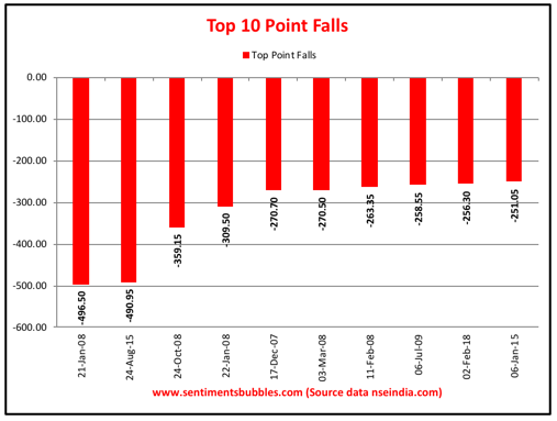
Comparing the recent fall in the benchmark in terms of the number of points lost is an inherently flawed exercise and extremely misleading; it is a classic case of lying with statistics. Unfortunately, that is what most of the financial media is doing. Given that the benchmark is quoting north of 10000, the recent pullback is pretty much ‘inline’ and not extraordinary. We shouldn’t be looking at the fall in the Nifty 50 by the number of points lost, but we should we look at it in percentage terms instead. The size of the up move has been so gargantuan and one-sided, that the pullback ceases to be alarming when analysed. The singular point I am trying to make is that the price action that we witnessed in 2017 was the unusual part and what we see now is pretty much normal. I think many of us have got that backwards.
Gap Ups and Gap Downs
The image below shows how much of the Nifty 50 performance has come during market hours and how much has come outside market hours. I have run the number for the period from 8th November 2016. The last open that is considered is the one on 9th February 2018.
If you had bought the Nifty 50 at the close of every trading day (beginning with 08th November 2016) and sold it at the open the next day, your cumulative gain would have been 37.89 percent. If instead, you had bought the benchmark at the open of every trading day and sold it at the close, your cumulative loss would have been 16.98 percent. Though I haven’t run the numbers for earlier periods, I think this pattern has been prevalent from the calendar year 2003, just that it hasn’t been quantified.
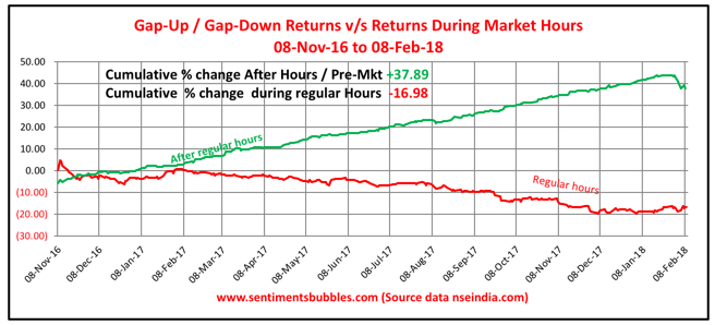
What the numbers conclusively proves is that the entire up move of the Nifty 50 occurs outside market hours (for the period under consideration). In other words, ‘gap-ups’ account for the cumulative gains in the benchmark. During market hours (on an aggregate basis), the market has declined.
Late on 9th February 2018, the Securities and Exchanges Board of India (SEBI) announced that Indian Stock Exchanges would suspend the trading of their indices in international markets. Nifty futures were actively traded on the Singapore Stock Exchange (SGX) and sgxnifty.org had become a ‘go to’ site for all market participants before Indian bourses opened for trading. Will SEBI action take care of all the gap-ups and gap-downs? Not in the least. In fact, it might make things worse. But we are still six months away from the withdrawal of SGX contracts.
Reality is a bit nuanced. Stock Exchanges in India were clamouring for an extension of trading hours to ‘capture’ the volume of trading that was being lost to the SGX. What SEBI has addressed is the issue of extension of trading hours in the Indian Stock Market. I sincerely hope that the vexed question of extending trading hours will now be buried forever; SEBI shot the messenger. In my opinion, the SEBI directive needs to be applauded.
Should we Buy the Dip?
All of us want to know if ‘it is over’ and whether or not we should be buying the dip. Will we have a V-shaped recovery? (Over the years we have had so many of them). Or will this be the big one? In other words, buying the dip might be a mistake, or it might not be. Call me ambivalent if you will, but I know of nobody who can answer these questions in real-time, with any degree of certainty. At all times, one has to be very humble about ones stock-picking / fund-picking capabilities and accept that there are just too many moving parts to the investment game. I’ll try and provide some perspective.
There is research that suggests that the correct response to Volatility is to exit the market and then re-enter when the Volatility subsides. In other words, sell when the market starts to fall and start buying when the market starts recovering. The researchers claim to have tested their strategy in multiple environments. In real-time, these two phases (when the markets start falling and when they begin rising) are indecipherable. With the benefit of hindsight (which the researchers have), it is easy to conclude.
Since the markets tend to go up more often than they go down, I would be inclined to believe that it makes sense to buy the dip. The caveat is: you have to be buying for the long-term, not for an expected bounce. At the same time, what you buy and how you buy would matter more than anything else.
Conclusion
As is only to be expected, investors want to assign reasons for the pullback in the benchmark indices. I don’t see why they matter. Whether the sell-off was induced by Algorithms, esoteric Volatility products, the rise in Bond Yields or changes in the Long-Term Capital Gains tax provisions, who cares?
As Volatility spiked, all of us were shaken out of our complacency. We were in a bubble – a bubble in complacency and like all bubbles, it has now burst. I think most of us (I included) were fooled by randomness and we did trade in a predictably irrational manner – just the way all humans beings are wired.
Once the complacency bubble burst, the collective swathe of human emotions that Benjamin Graham referred to as Mr Market decided the way to go was down, down, down. Which reminds me of this Beatles song called ‘I’m Down’, the lyrics of which I have embedded below. I hope you enjoy listening to it.