The calendar year 2018 has begun with a bang. It’s off to the races, almost immediately. I’ll start with the returns for the year 2017. (Readers can click on any of the images for a magnified view)

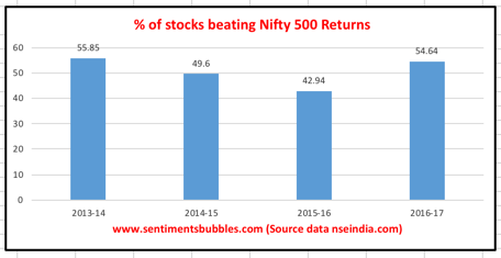
During the year 2017, how many of the benchmark components clocked returns that beat the benchmark and how does it compare with earlier years? That is shown below for both, the Nifty 50 and the Nifty 500. It shows the breadth of the returns kaleidoscope. The surprising part was that the number of Nifty 50 ‘issues’ that beat the Nifty 50 returns were at the lower end of the historical metric. Not so in the case of the Nifty 500.

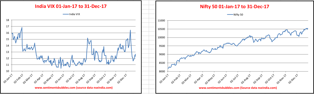
The Volatility Index made new lows for the whole of 2017. Remember that the Volatility Index moves lower as the Nifty 50 moves higher. If you look at the images carefully, the India VIX is sloping gently from right to left, and the Nifty 50 is sloping from left to right. There are no hiccups in the directions for the most part throughout the calendar year 2017.
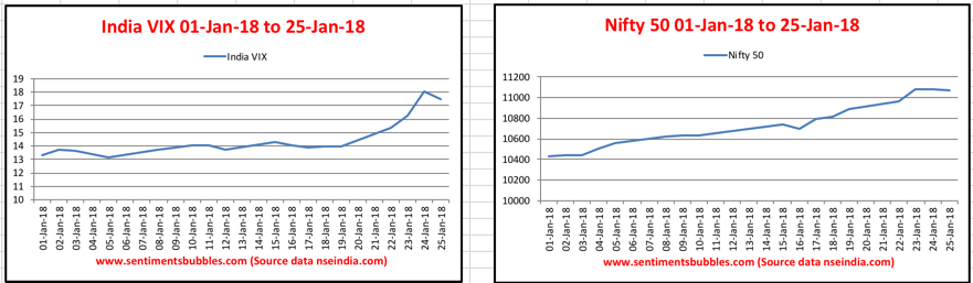
In the current calendar year, both the Nifty 50 and the India VIX seem to be moving higher as can be seen in the image below. Just shows how traders are positioning for the announcement of the Union Budget later this week. Their paths will diverge, sooner rather than later.
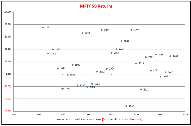
Heading into the current calendar year, everyone wants to know what kind of returns to expect. The image below is a scatter diagram of historical annual Nifty returns. As is apparent, yearly returns are all over the place. I don’t see any correlations whatsoever between the calendar year returns. Trying to predict market outcomes is foolish.
Sector rotation, they say is the ‘lifeblood’ of any and every bull market. The images below show how money is moving from one sector to another. Why does this happen? Money management involves ‘rebalancing of portfolios’ which is done twice a year by most managers. For equally weighted portfolios, overweight positions get trimmed, and money moves elsewhere. Rebalancing of managed portfolios ensures that the risk-reward equations for the portfolio are optimised.
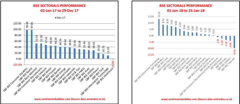
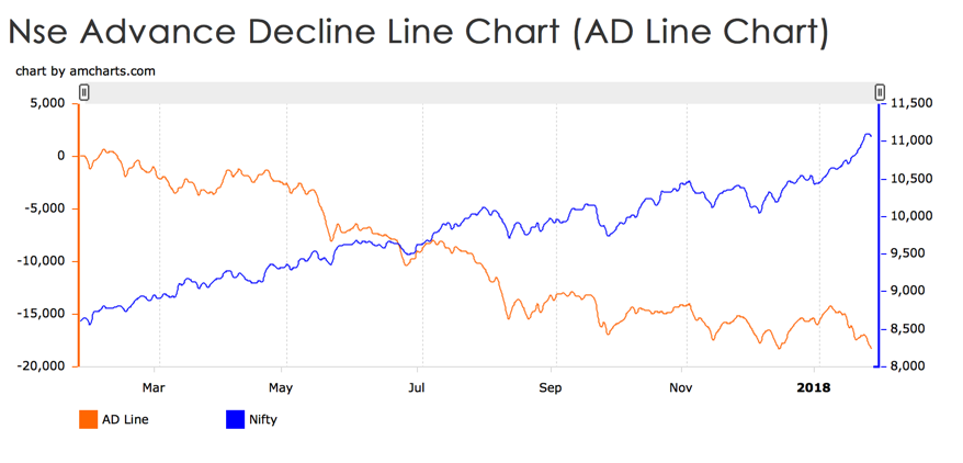
Even though the benchmark indices are in the green, the Midcap and Small-Cap stocks have corrected. What happened? In my opinion, buying high and selling higher seemed to have become so comfortable that investors got carried away. In almost every bull market, the primary reason for purchasing a stock tends to veer to the fact that ‘someone of consequence’ is also buying the same. As a trading heuristic this methodology does work, but so do darts. In the current calendar year (thus far), prices have diverged – the Midcap and Small-Cap names have corrected, but the benchmark indices show robust gains. The Advance Decline line (AD LIne) chart mirrors this divergence in the stock prices perfectly. What is the AD line and how is it computed? Very briefly:
- The AD line plots changes in the value of the advance-decline index. On any trading day, of the smorgasbord of listed stocks, some are advancing, and some are declining.
- Net Advances for a day would show the total number of advancing stocks less the total number of declining stocks. Net advances will be positive if the number of advancing issues is higher than the number of declining issues, else it would be negative. The AD line is a measure of Net Advances plotted on a daily basis.
The AD line at the close of trading on 25 Jan 2018 looks like this:
 (Source: Traders Cockpit)
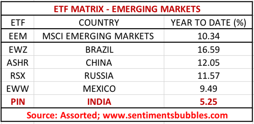
The rally in equities as an asset class is a global one. India is one of the top ten stock markets in the world. Stocks in India are going up because globally stocks are going up. Stock prices in India will mirror global trends, more so now than ever before. Globally investing returns from any country are measured by the ETF (Exchange Traded Fund) for that country. The image below shows the country ETF returns for Emerging Market (EM) states for the current calendar year – Year To Date (YTD). The PIN ETF, which is the ticker for India is lagging the Emerging Markets benchmark EEM and other Emerging Markets. That should get resolved once the Union Budget announcement is made. I should hasten to add that I don’t know in which direction! In other words, post-budget, we are back to looking at ‘global cues’ for ‘direction’.
There is a market aphorism that says: ‘As goes January, so goes the year’. What that implies is that stock market returns for January tend to predict the yearly returns with a very high degree of accuracy. There are just three trading days left in the current month, assuming the Nifty 50 manages to hold on to its gains, does historical precedent prove any such seasonality?
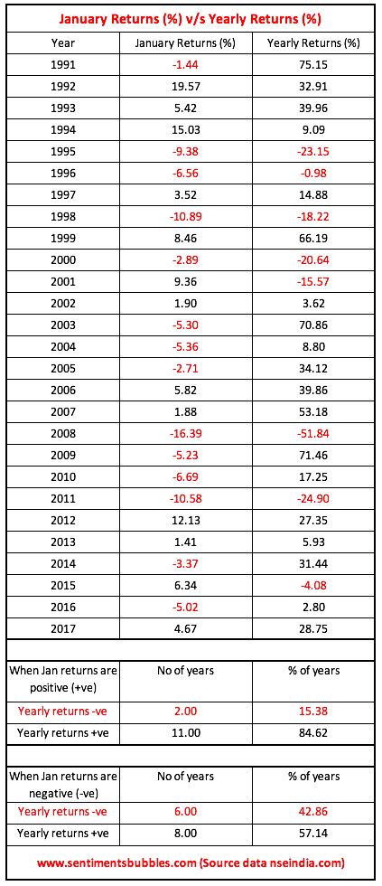
The yearly returns tend to be positive when January returns are positive 84.62 percent of the time. However, even when January returns are negative, annual returns are positive 57.14 percent of the time. Hence, I wouldn’t want to attach much significance to ‘January Seasonality’. What the data does prove is that, more often than not, stock markets tend to give positive returns.
I’ll leave you with this final chart of the U.S. Dollar. In my opinion, dollar parity matters for all Emerging Markets and India is no exception. We began the calendar year 2017 with a lot of talk about how the interest rates in the United States would move higher and the U.S.Dollar would strengthen and the related blah blah blah. Guess what, interest rates in the U.S. did move higher, but the U.S. Dollar moved lower. I haven’t read or heard of any commentator who got this correctly. Nobody, absolutely nobody, predicted that the DXY (which is the ticker for the Dollar Index) would get decimated in the manner shown below. In percentage terms, the DXY has fallen by roughly nine percent since the date that Donald Trump got elected. Historically, a weak dollar has been bullish for Emerging Markets. Will the U.S.Dollar continue to weaken in 2018? Keep guessing.
